Responsive YouTube <iframe> Embedding with Bootstrap
How to properly embed a YouTube video in a Bootstrap 4 or 5 site

I create tech content primarily on YouTube. I write about web development, design and tooling from a solopreneur's perspective. My wife and I are raising four kids, and I enjoy running ultras in my free time.
Copy & Paste Doesn't Always Work ☹️
It comes close, but if you copy and paste the embed code off of a YouTube video, you can still run into issues. Particularly on mobile. I found this out just this morning when adding a tutorial video to a simple web app I made using Bootstrap 5.
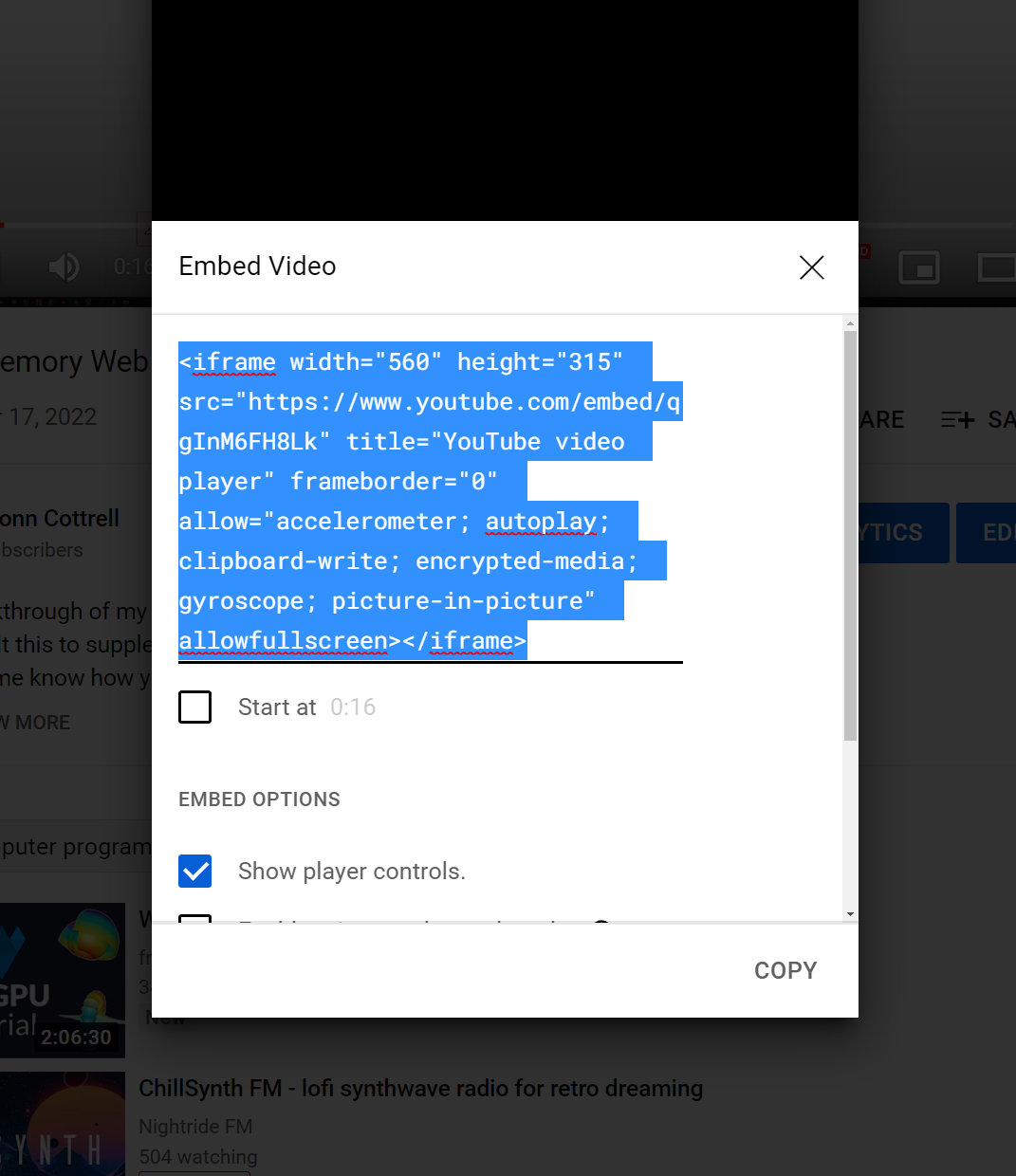
This worked fine, and previewed well on localhost:5500. But, it was screwy on mobile when I previewed the live site on my iPhone 11. The fixed width was extending off the screen to the right. If you're like me, anytime I encounter stuff like this, it causes me an infinite amount of strife.
Luckily, there's a pretty easy fix that Bootstrap documents. Bootstrap 4 handles it this way. Bootstrap 5 handles it this way.
The Code 💾
Both have you wrapping a parent html <div> with either .embed-responsive or .ratio (depending on the Bootstrap version) and then having the iframe within that element.
Bootstrap 5
My div looks like this:
<div class="tutorial container text-center my-5 ratio ratio-16x9">
</div>
And I stripped all the fluff out of the YouTube copy/paste embed code so that I was left with this for the iframe:
<iframe src="https://www.youtube.com/embed/qgInM6FH8Lk?rel=0"
    allowfullscreen>
</iframe>
Bootstrap 4
There are different semantics with Bootstrap 4 which accomplish the same thing:
div:
<div class="tutorial container text-center my-5
    embed-responsive embed-responsive-16by9">
</div>
iframe:
<iframe class="embed-responsive-item"
    src="https://www.youtube.com/embed/qgInM6FH8Lk?rel=0"
    allowfullscreen>
</iframe>
Interestingly, I accidentally used the Bootstrap 4 solution initially and it worked on mobile while not fully expanding on larger screens.
Solving Hero Section Flex Box Issues
After having found this original solution, I ran into another use case a couple weeks later. When I wrapped the iframe with ratio and ratio-16x9, I was getting unwanted behavior: the video was getting too big, and it was displaying beneath my Hero Section's Title instead of beside it.
If you're using rows and columns and hit a snag like this, you will want to make sure the div you're adding ratio too is within the div you're using col on.
I also found it useful to style the iframe with min and max widths and heights so it wouldn't shrink too small.
See below:
        <!-- =================================HERO================================= -->
      </header>
      <div class="container-fluid bg-light border-3 border-gold bg-gold-gradient col-xxl-12 px-5 py-5">
        <div class="row flex align-items-center g-5 py-5">
            <div class="px-5 col-lg-6">
              <h1 class="main-font display-1 fw-bold lh-1 mb-3 ">Origami West</h1>
              <p class="lead">Super good thing win fast metal big sound.</p>
              <div class="d-grid gap-2 d-md-flex justify-content-md-start">
                <a href="#beta" class="btn btn-lg btn-outline-gold">Beta Sign-up</a>
              </div>
            </div>
          <div class="col-10 col-sm-8 col-lg-6">
            <div class="ratio ratio-16x9 m-0 p-0">
              <iframe class="" style="min-width:280px; min-height:157px;" width="560px" height="315px" src="https://www.youtube.com/embed/lwkGjzT-0QA?controls=0" allowfullscreen></iframe>
            </div>
          </div>
        </div>
      </div>
Embedding on Hashnode 🖥️
Bonus! Here's the video in question. And it's super easy to embed right here on Hashnode. All that's required is a handy percent sign 😀. Here are the embed docs.
%[https://www.youtube.com/watch?v=qgInM6FH8Lk] 👇
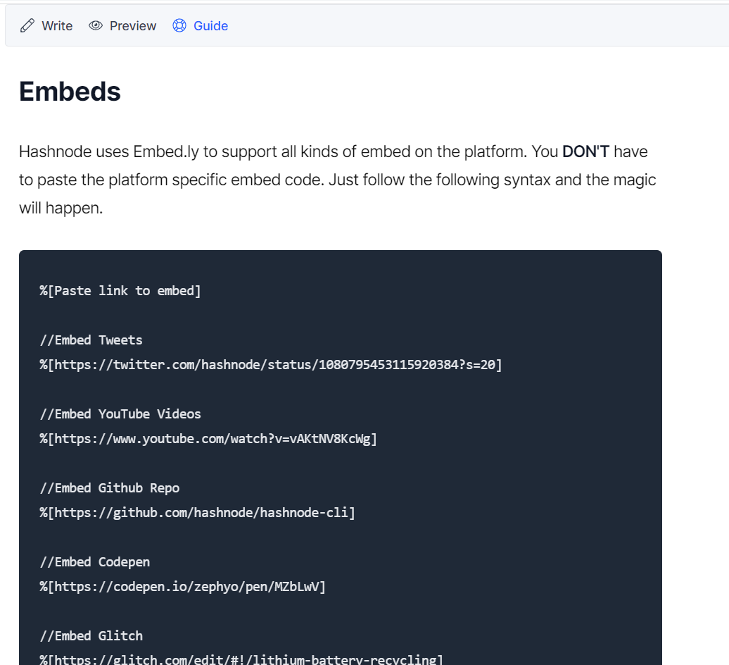
And in writing this article, I realized that @Hashnode has made it even easier to find snazzy shortcuts without jumping all the way to the docs if you choose. There's a Guide link at the top of the article next to the Preview link.
This is a great, quick resource for markdown, embeds, and other commonly used tools for blogging here. 👇
Say Hey! 👋
Hope this is helpful for you, and you have a great day!