Build an Open Source CSS Library

I create tech content primarily on YouTube. I write about web development, design and tooling from a solopreneur's perspective. My wife and I are raising four kids, and I enjoy running ultras in my free time.
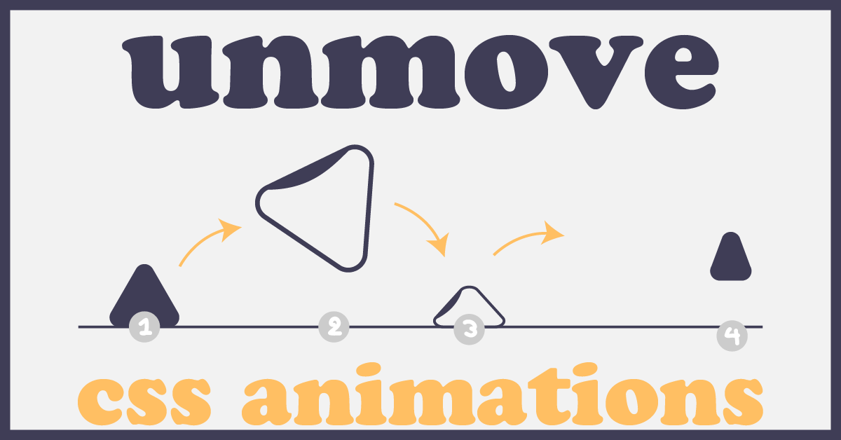
Meet unMove: my latest project where I built my first open-source library using vanilla CSS, GitHub Projects, Issues, tags and releases, semantic versioning and jsDelivr.
I set out building this to better learn good project management and the ins & outs of maintaining an open source project.
If you're interested in open source or project management...or just staying organized and on task amidst a never ending stream of ideas, this may be helpful for you!
I'll walk you through all the pieces of this project in the order that I built them. I've managed to put together a good boilerplate for a project, and look forward to continuing to contribute to its growth!
README 📖
Please create a readme file. 🙏
You probably know it, but don't forget to do this. It is the best place to showcase your project. And GitHub will automatically prompt you to initiate the repository with a readme, so there's no excuse to leave this out.
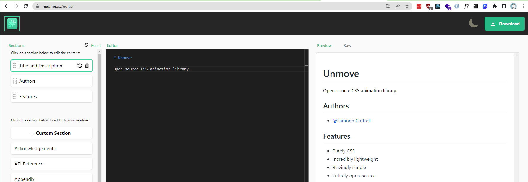
Check out readme.so by Katherine Peterson: she's made an incredibly easy to use browser-based tool. It lets you to create a clearly sectioned readme using a drag and drop template editor that you can then copy and paste into your repository.
If you don't have enough info at the beginning, make the readme anyway and come back later to fill it in.
Here's what mine looked like initially; it wasn't perfect, but it had some of the bones of what the project would become. I copied and pasted all of it from readme.so except for the gif. I actually designed that graphic and made it spin on giphy so I could have something animated quickly on the readme.
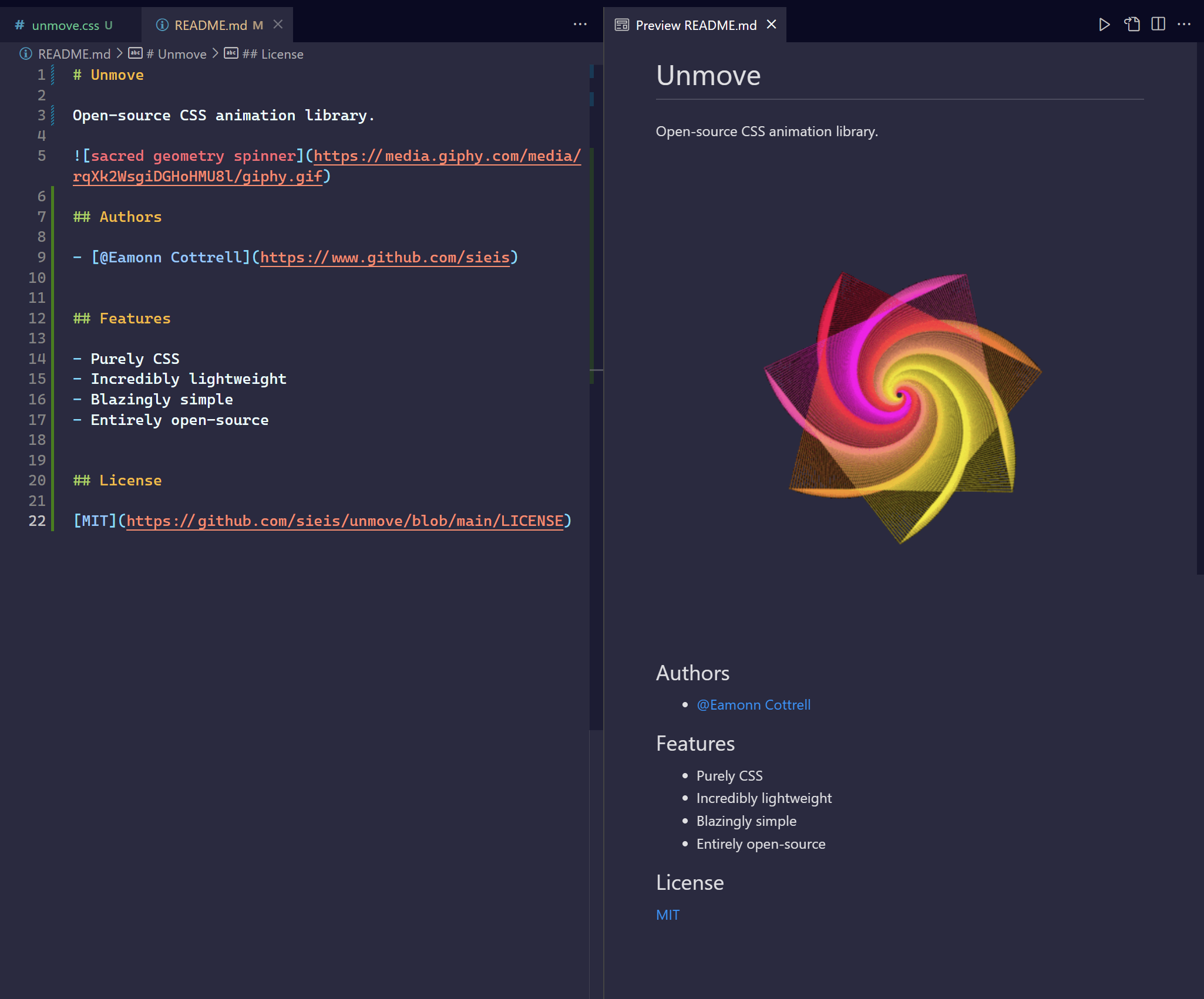
Bonus: In the current, updated readme I used an svg and edited the inline <style> to add the rotation animation. It made it a lot cleaner than the giphy version. 😊
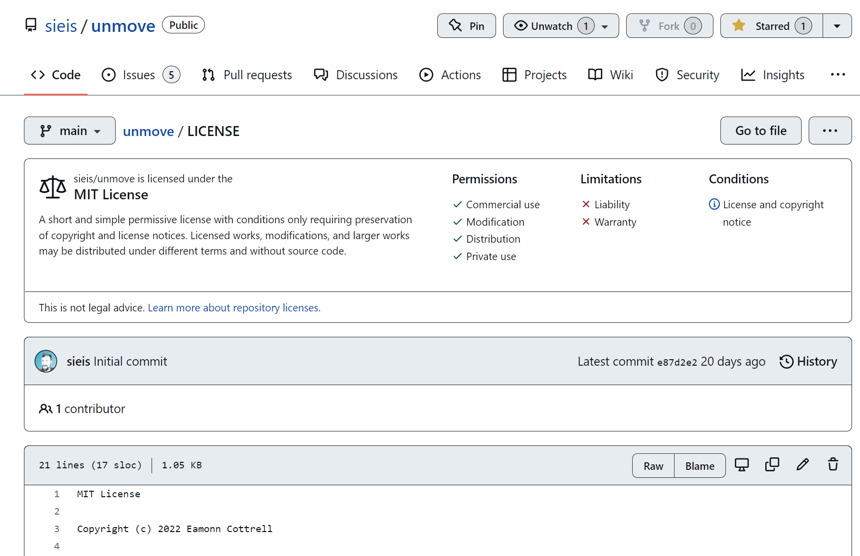
License 🎓
Another easy addition. You'll be prompted for this too. MIT License is an easy way to make the project completely open sourced. Go here to check out how to choose a license for your repository.
I simply selected MIT for unMove's license and am good to go without any further edits:
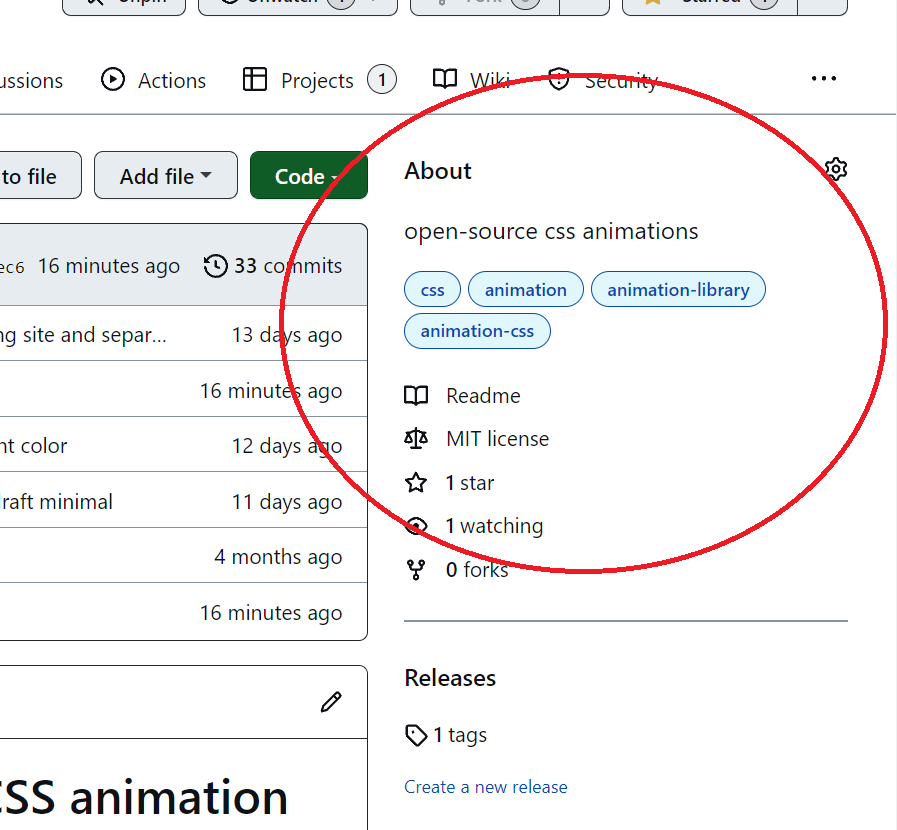
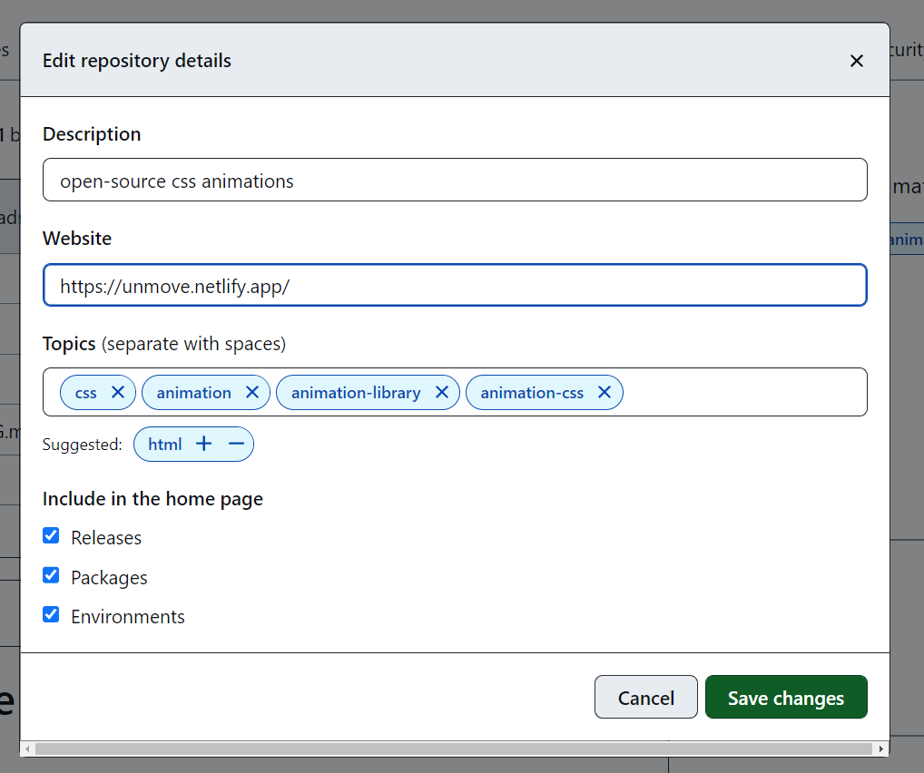
Descriptions && Tags
Don't neglect the right sidebar. Here's where you should add a description for your project as well as tags. We'll come back later when we create a new release too 😊.
Issues && Projects
I've recently been using Trello for freelance project management, and it's been a great solution to keep me and my client on task.
For this project, though, we'll use the built in capabilities from GitHub. 🙌
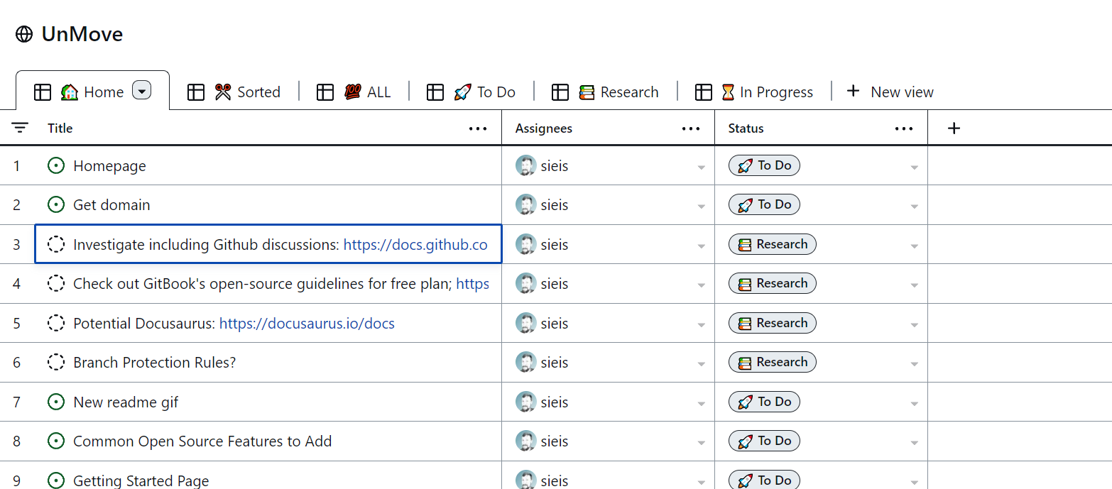
GitHub projects allows you to create board or table-view task lists for your project.
Here's what they'll look like when you create some:
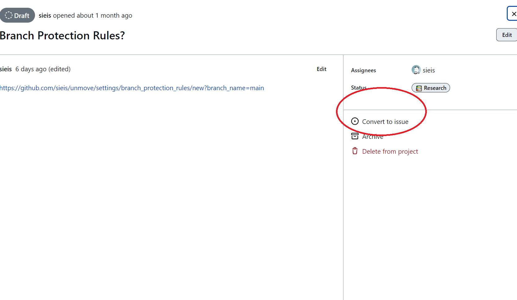
And you can convert them to Issues so they show up in your Issues Tab for assignment to team members 👇
Alternatively, you can create an issue from the Issues tab and then assign it to a Project 👇
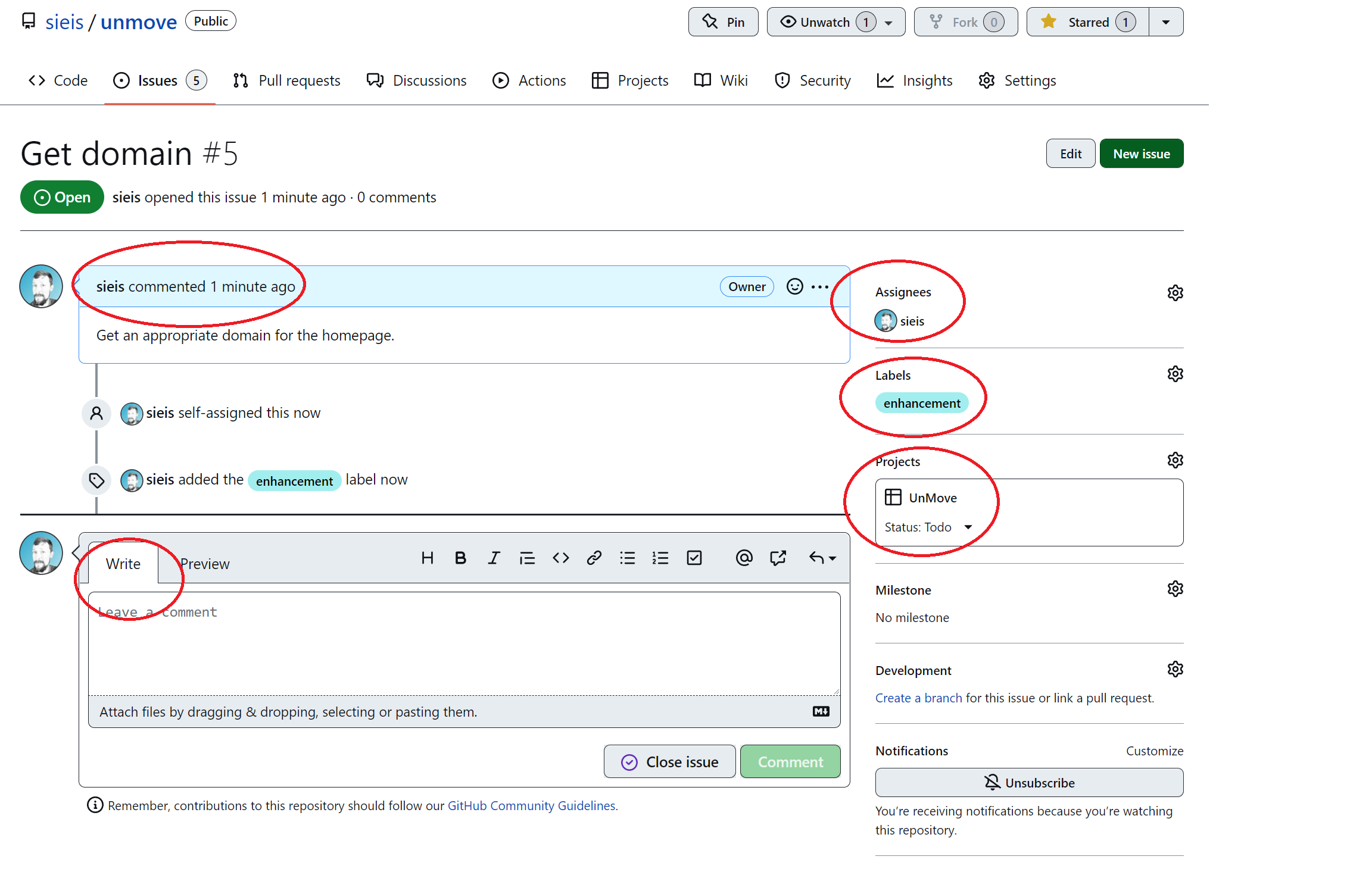
Since this project consists of just me, I'm assigning everything to myself, but I'm also going through the small step of adding labels like enhancement, feature, good first issue, etc.
Even though these first small issues don't require much documentation, I want to get in the habit of creating well documented comments and reviewing the changes before merging into main.
You don't need to have grand plans or incredible features listed here. Simple things are fine. It's important to simply set good habits of documentation, assignments and code review.
Branches: Main vs Other
So I've known branches were a thing for a while, but I've never bothered using one in any of my personal projects.
Turns out they're a real good idea (shocker), and a real helpful tool even on small projects. I'll use development branches in this project any time I make changes to the codebase. This way I can check that everything is working without effecting the current (already working) main branch.
Simply click the branches tab and type the name of the branch you'd like to create.
Now once you clone the repo to work locally, you can $git checkout develop to switch to the develop branch. This will allow for changes to be tested without affecting the main branch.
This is a new habit for me, and I am happy to be leveling up my developing processes.
Pull Requests, Briefly
More often, though, after forking and cloning the repo, you'll want to make your own branch locally:
$git checkout -b <new-branch-name>
Then, when you push this <new-branch-name> to your forked repo, you'll have the option to open a pull request against the main branch.
Launch
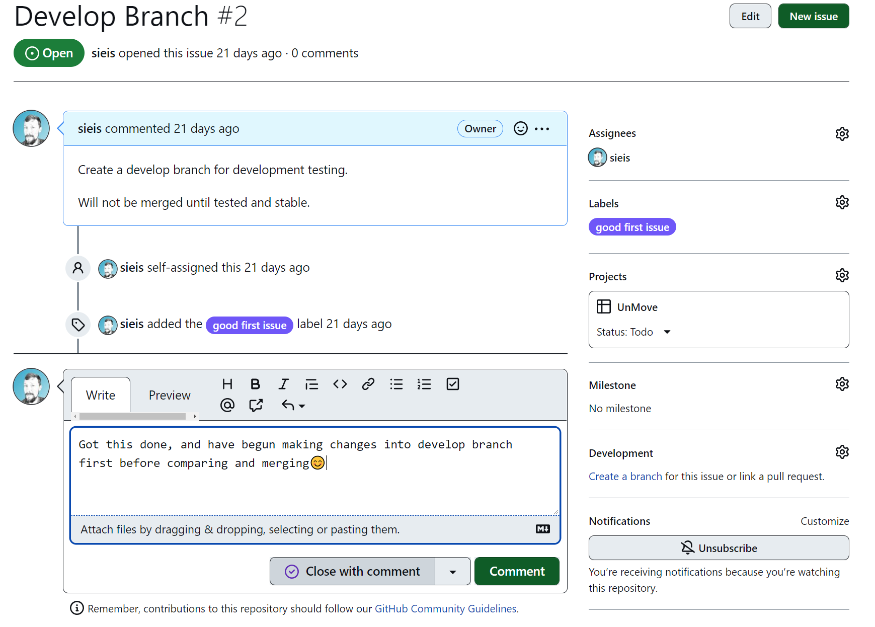
I suppose we need to make something functional before launching. At the very least, I want this library to have a couple CSS animations available immediately. I've developed these in a develop branch to test out, and once satisfied, I merged those changes to the main branch.
$git checkout main
$git merge <new-branch-name>
Versioning && Git Tags
Here's another thing I've known about for a while, but only actually used once before. I want to launch with an actual version number. In this case, v0.1.0-alpha. In order to do this, we'll need two things:
The release version won't work unless you have a git tag in your codebase, so we'll do that first.
Git Tags denote spots in your commit history where big things happen...like a version release!
This will show your commit history:
$git log --pretty=oneline
This will tag the spot you choose in your history. Replace the hashmarks with the first digits in the checksum from your commit history.
$git tag -a v0.1.0-alpha #####
Pushing this change works differently too. If you run $git status everything will look like it's up to date.
Instead, run $git push origin v0.1.0-alpha and we're good to go!
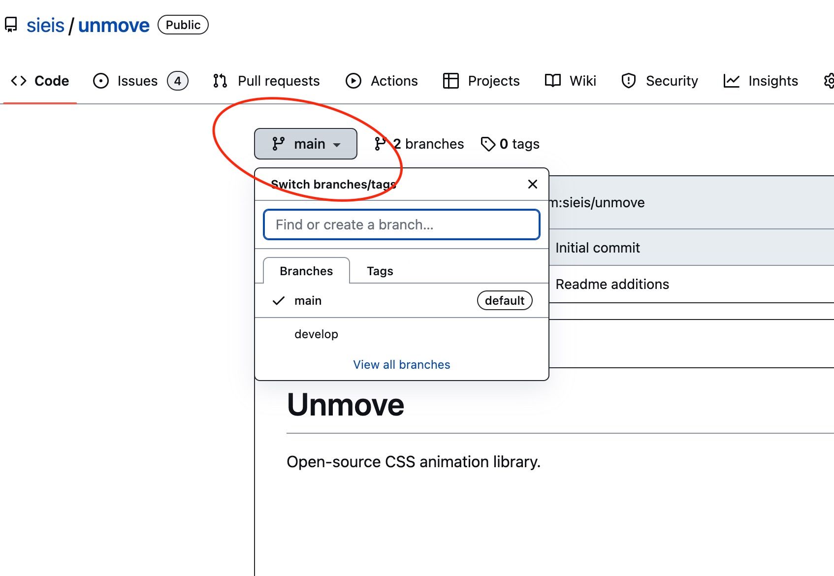
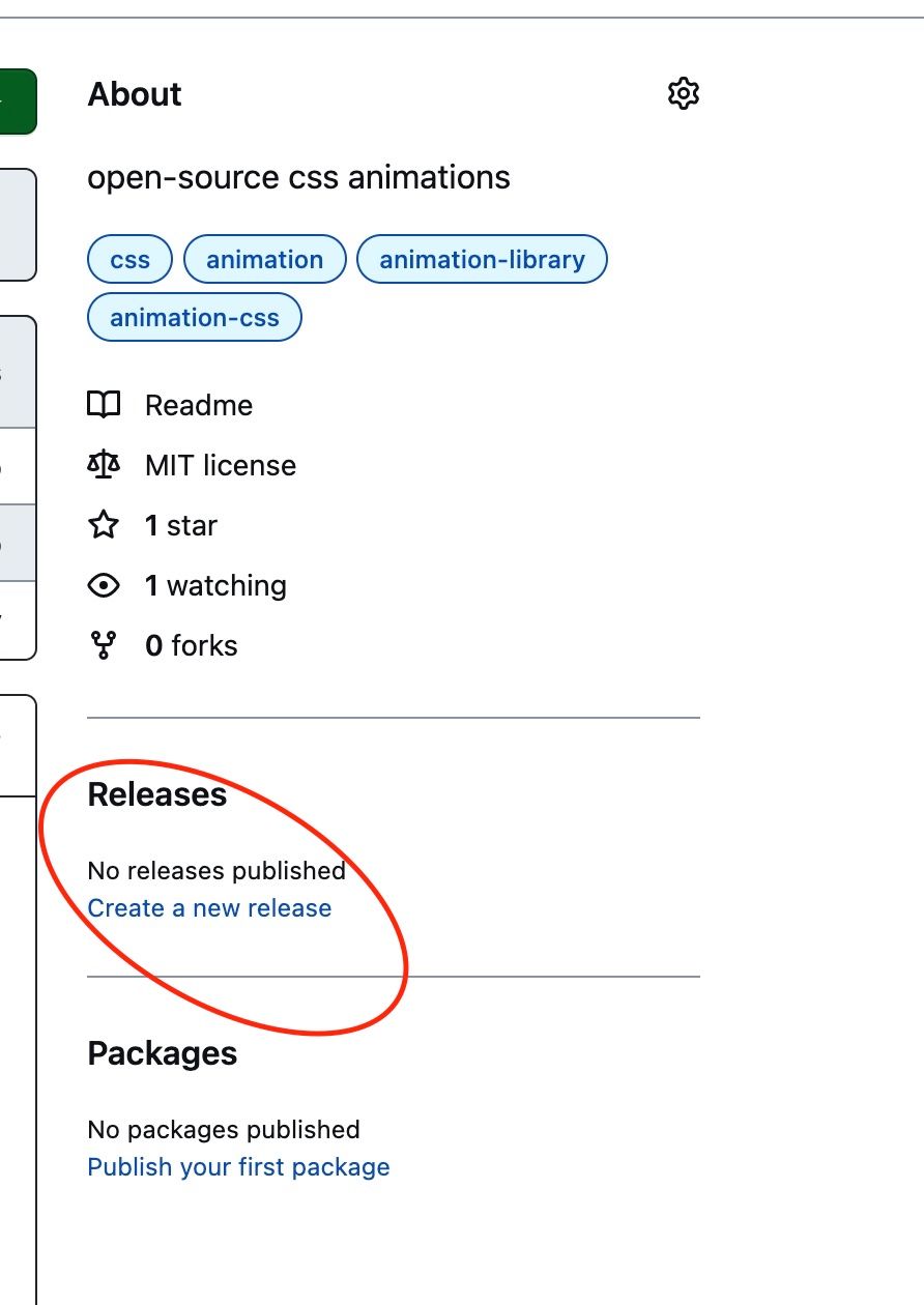
Now, back in GitHub, we can make a version release by clicking Create a new release in the righthand side bar.
Website
Building a website is usually the second order of business...right in line with purchasing a sweet domain. I've focused first on building up a framework of good processes.
But the time has now come. We do indeed need a website. It doesn't have to be much, but it does have to be clean and concise.
Enter: Netlify. Or a host of other...hosts. 😁 Use whatever you're comfortable with, but I have been very impressed using Netlify especially for personal projects. It's allowed me to hone my git and GitHub skills and incorporate that into the development workflow.
I love how deployment works: push a change to my GitHub repository, and it deploys/updates automatically.
Bonus: Netlify has an open source plan if you meet certain criteria. Here's the link to that, and the basics are below:
- Include open source compatible license ✅
- Have a code of conduct
- Link to Netlify ✅
- Cannot be a commercial project ✅
As you can see, my site (https://unmove.netlify.app/) is currently a bare bones display of the first few animation classes available.
JSdelivr CDN
JSdelivr is, simply put, a free CDN for Open Source.
Content Delivery Networks (CDN) help deliver content fast by using globally distributed servers and help cache content at the network edge. 🚀
CDNs are widely used, and it will allow our users the option of using our stylesheet via a JSdelivr link rather than downloading it into their project.
And since our project is on GitHub, we can simply load any release, commit or branch by using this link template:
// load any GitHub release, commit, or branch
// note: we recommend using npm for projects that support it
https://cdn.jsdelivr.net/gh/user/repo@version/file
I updated our README file's Quick Install Instructions to reflect these changes once I had the first working CSS distribution.
In our case, adding the following to the html page's <head> allows us to use unMove! 😃
<!DOCTYPE html>
<html lang="en">
    <head>
        <meta charset="UTF-8">
        <meta http-equiv="X-UA-Compatible" content="IE=edge">
        <meta name="viewport" content="width=device-width, initial-scale=1.0">
        <link rel="stylesheet" href="https://cdn.jsdelivr.net/gh/sieis/unmove@main/dist/unmove.css">
        <title>unmove demo</title>
    </head>
<body>

</body>
</html>
CSS
What's going on? 1300 words in and we're just now at the actual product. We were writing a CSS library after all, remember!?
Here's the thing: code is important, but getting a project and/or product organized can be just as cumbersome a process as writing the code. And if it's not done up front, if standards aren't set, it's liable to get real messy real quickly. 🤔
So, yes, here we are at the end...and just beginning to review the code.
But so much is in place now! And hopefully, you've picked up some knowledge that you can take into your own projects.
One of the reasons I picked a CSS animation library was precisely so it wouldn't be too heavily code-intensive. I wanted a quick way to get a working MVP into the world.
And we did exactly that.
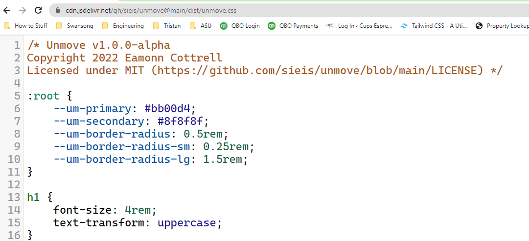
Here is a link to the CSS from JSdelivr. Pull this up in another tab to examine the code and I'll walk through the classes below.
Spinning Animation
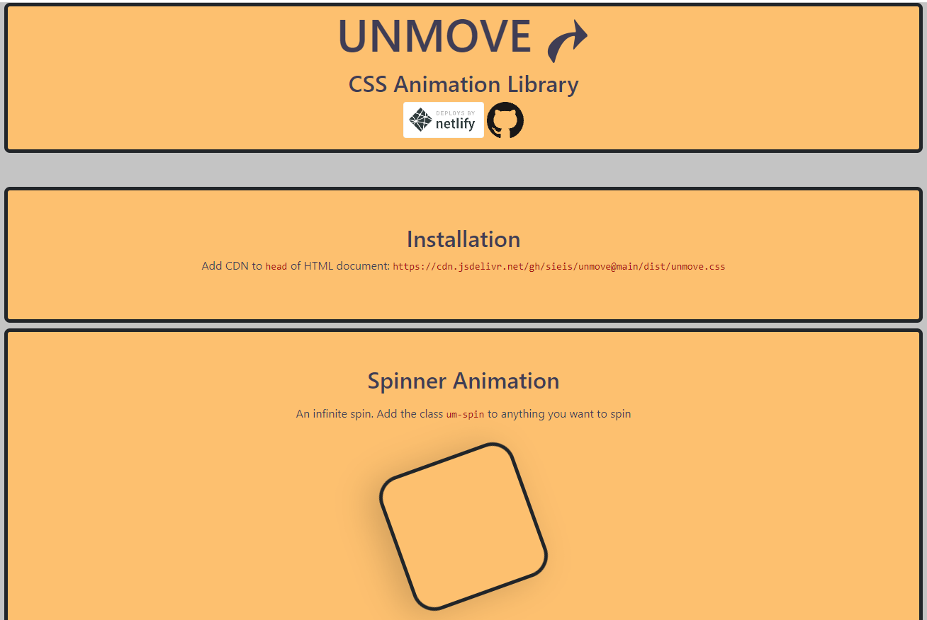
Here's a look at the Spinner Section from unMove's example page:
    <section class="text-center container border border-dark border-5 rounded-3 p-5 my-2">
      <h2>Spinner Animation</h2>
      <div class="p-2  text-center">
        <p>An infinite spin. Add the class <code>um-spin</code> to anything you want to spin
        </p>
        <div style="height:200px;width:200px"
          class="my-5 mx-auto spin border border-dark border-5 rounded-5 shadow-lg um-spin">
        </div>
      </div>
      <div class="p-2  text-center">
        <p>Crank up the speed. Add the class <code>um-spin-fast</code> to go twice as fast.
        </p>
        <div style="height:200px;width:200px"
          class="my-5 mx-auto border border-dark border-5 rounded-5 shadow-lg um-spin-fast">
        </div>
      </div>
      <div class="p-2  text-center">
        <p>Chill out. Add the class <code>um-spin-slow</code> to calm down and go real slow.
        </p>
        <div style="height:200px;width:200px"
          class="my-5 mx-auto border border-dark border-5 rounded-5 shadow-lg um-spin-slow">
        </div>
      </div>
    </section>
And the CSS:
/* Infinite Spinning Animation */
.um-spin {
    animation: spin 3s linear infinite;
}
.um-spin-fast {
    animation: spin 1.5s linear infinite;
}
.um-spin-slow {
    animation: spin 6s linear infinite;
}
@keyframes spin {
    from {
        transform: rotate(0);
    }
    to {
        transform: rotate(360deg);
    }
}
This is fairly simple. We are using transform: rotate() to rotate the 200px square divs. All that the .um-spin classes do is apply the animation spin. One rotation will take either 1.5sec(.um-spin-slow), 3sec(.um-spin) or 6sec (.um-spin-fast). And then infinite simple tells it not to stop.
The keyframes are very simple. We go from 0 degrees to 360 degrees.
News Ticker Animation
Many of the solutions for the news ticker style animation involved writing JavaScript. I've got nothing against that, but I simply wanted a pure CSS version. After looking at a few CSS builds, I modeled unMove's off of a solution I found on Nolte here.
Here is the html from the example site:
        <div class="um-news-wrap">
          <div class="um-news-tick">
            <!-- free handdrawn vectors used from https://goodstuffnononsense.com/ -->
            <img src="./img/earth@4x.png" alt="" class="um-news-item">
            <img src="./img/saturn@4x.png" alt="" class="um-news-item">
            <img src="./img/mars@4x.png" alt="" class="um-news-item">
            <img src="./img/jupiter@4x.png" alt="" class="um-news-item">
            <img src="./img/venus@4x.png" alt="" class="um-news-item">
            <img src="./img/uranus@4x.png" alt="" class="um-news-item">
            <img src="./img/neptune@4x.png" alt="" class="um-news-item">
          </div>
        </div>
and the News Ticker CSS:
/* Scrolling News Ticker Animation */
.um-news-wrap {
    overflow: hidden;
}
.um-news-tick {
    display: flex;
    animation: news-ticker 6s linear infinite;
}
.um-news-tick:hover {
    animation-play-state: paused;
}
.um-news-tick-no-hover {
    display: flex;
    animation: news-ticker 6s linear infinite;
}
.um-news-tick-reverse {
    display: flex;
    justify-content: flex-end;
    animation: news-ticker-reverse 6s linear infinite
}
.um-news-tick-reverse-no-hover {
    display: flex;
    justify-content: flex-end;
    animation: news-ticker-reverse 6s linear infinite
}
.um-news-tick-reverse:hover {
    animation-play-state: paused;
}
.um-news-item {
    width: 16rem;
    /* min-width helps svgs behave properly in the scroll without having to manually set their height or width */
    min-width: 16rem;
    margin: 0 1rem;
}
@keyframes news-ticker {
    0% {
        transform: translate3d(0, 0, 0);
    }
    100% {
        transform: translate3d(-126rem, 0, 0);
    }
}
@keyframes news-ticker-reverse {
    0% {
        transform: translate3d(0, 0, 0);
    }
    100% {
        transform: translate3d(126rem, 0, 0);
    }
It is not as elegant as a JavaScript solution, but it works for our purposes. The first div with class=um-news-wrap sets 'overflow:hidden'. This hides everything outside the edges of the div.
The second div is what will move from side to side. This is the actual ticker. It's going to be twice as wide as the container because we're putting two copies of the items in it. This is so there's no stuttering in the animation.
As the first set of icons goes from right to left, the second set will then start scrolling across the viewable area. At the end of the animation duration, the first set will be ready to display immediately as the second set is scrolling off the viewable area.
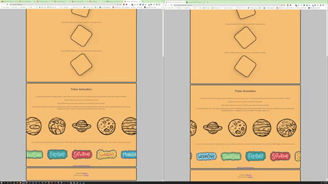
Without the duplication, halfway through the animation duration, there would be nothing scrolling across and then at the start of the next iteration, the original strip of images would pop into place. Below is a side by side example. The seamless setup with duplicate images is on the left, and the non-duplicate version is on the right 👇
Setting that overflow to hidden lets us manipulate the div in a way that looks seamless.
You'll notice that .um-news-item sets width and margin for the items. This is the hacky part. We are hardcoding widths both here and in the keyframe transform in order for the scrolling to work as intended. This only works with 7 items in the example because that's how I've calculated the widths.
16rem * 7 items + 2rem * 7 items = 126rem total
So, yeah, JS would be simpler. But this is a CSS project, and we like hacky things! 😂
Contributions
Last but not least, the beauty and the joy of open-source is the community. I've written up a CONTRIBUTING guidelines file, and welcome your input on this project.
This was a big motivation for taking on this project - I want to see what it's like maintaining a public, open-source project.
So, please hop over to the repo, give it a star, make a fork, read the guidelines, check out the issues, and contribute away! 🙌
Thank You
I appreciate you reading through this, and hope that you learned something helpful! If you did, let me know!
You can find me on Twitter, and I'd love to say hey 👋 https://twitter.com/EamonnCottrell